What is GPay's Today's Spend Indicator?
This project adds a Today's Spend Indicator feature to Google Pay. It shows the running total of money spent since midnight directly on the payment screen — right above the amount field — so users always know how much they have already spent that day before making another payment. The indicator updates automatically after every transaction and resets itself every midnight without any setup or manual input from the user.
Why I Chose This
As a regular GPay user, I experienced paying blindly throughout the day and only realizing I was running short on cash when it was too late. I wanted to design an elegant solution that creates financial awareness in the exact moment of transaction, without adding friction.
The Goal
Provide immediate, zero-friction visibility of daily spending at the moment of payment, helping users stay conscious of their budget without the chore of manual tracking or complex setups.
Interactive Screen Walkthrough
Launch & Start (Spend: ₹0)
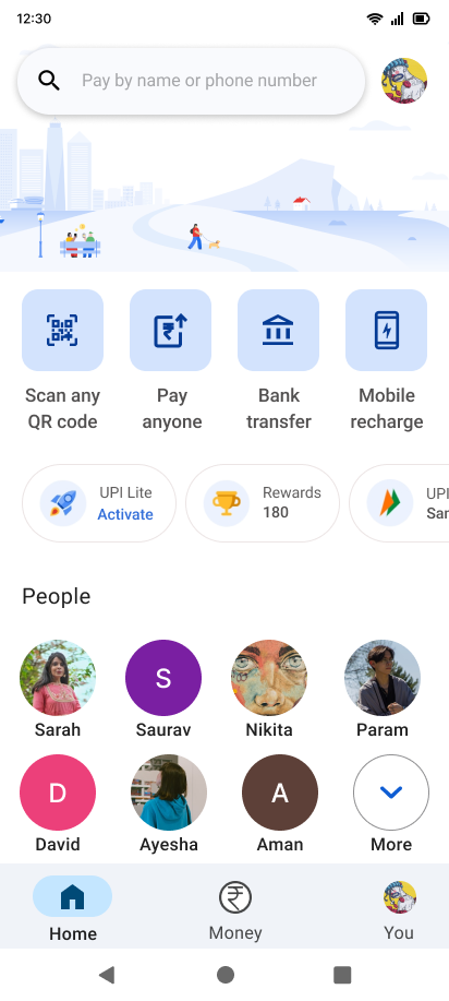
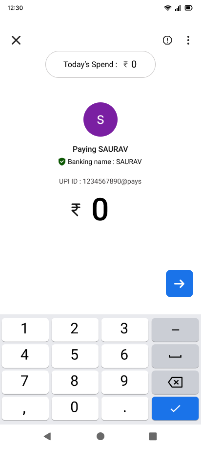
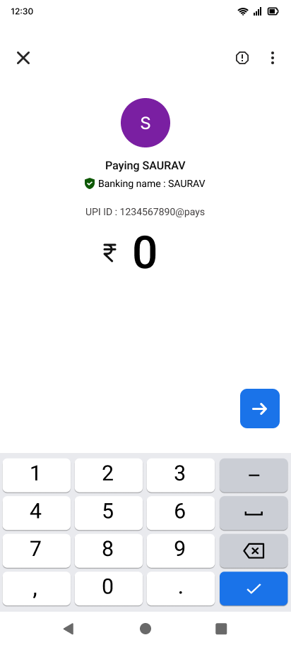
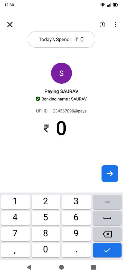
The flow starts with the familiar Google Pay home screen. When the user initiates a payment, they are greeted by a subtle Today's Spend indicator pill at the top, showing ₹0 before any transaction takes place.
First Payment (₹100)
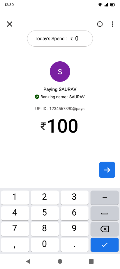
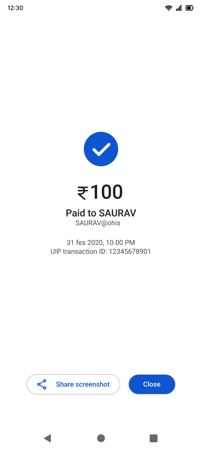
The user inputs ₹100 to pay Saurav, selects their bank, and completes the payment. The transaction page confirms the payment, updating the internal daily spend counter silently.
Second Payment (₹200)
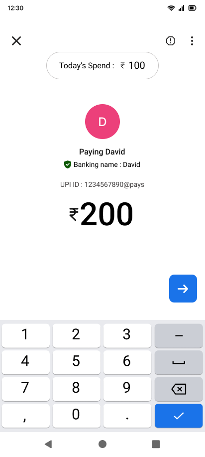
Later in the day, the user opens the payment screen to pay David. The indicator now prominently shows Today's Spend: ₹100. The user enters ₹200, is aware of their current total, and initiates the transaction.
Before & After Comparison
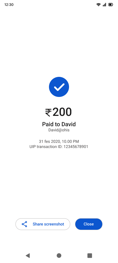
By comparing the old payment layout to the new feature addition, it's clear how the spend indicator integrates naturally into GPay's design system without adding visual clutter or cognitive noise.
User Persona
Meet Meera, the user archetype representing young professionals who rely heavily on quick digital payments but struggle with passive daily budget tracking.
Meera, 26
"I make decent money, but multiple small UPI transactions add up so fast that I only realize I've overspent when my bank balance runs low."
💭 Thinks
- "Where did all my money go this month?"
- "I make decent money but I'm always broke by month end"
- "I should track my spending but it's too much effort"
🧠 Feels
- Anxious checking bank balance
- Guilty after impulse purchases
- Overwhelmed by detailed budgeting apps
🛑 Pain Points
- Makes multiple small UPI payments daily without realising total
- Only notices overspending when balance is low
- Doesn't want a complex budgeting app, just quick awareness
🎯 Needs
- A simple, effortless way to see today's spending at a glance
- No manual entry, no setup
- Something that works passively in the background
Research & Validation
Validating the awareness gap with real users and reviewing the existing GPay structure.
User Interviews
I spoke with 5 regular GPay users and asked a simple question: "Do you know how much you have spent today right now?"
- None of them could answer without opening their transaction history.
- 3 out of 5 had experienced running out of money unexpectedly because they lost track.
Interface Analysis
Examining GPay's information architecture and flow:
- Transaction history exists but requires navigating to a separate screen.
- No summary of daily spending is visible during the active payment flow.
- Account balance tells you what is left, but not how much you have already spent.
Key Finding
The spending data already exists inside the app. No new data collection or complex systems are needed — we simply need to place that information at the exact moment of decision-making.
Insights from the Field
Awareness in the Moment
Awareness at the moment of action is infinitely more powerful than after-the-fact reflection. Knowing your total spend just before you pay changes behavior; knowing it at the end of the day changes nothing.
Awareness over Budgeting
Users don't want to budget — they want to be aware. Budgeting requires setup, discipline, and planning. Awareness requires zero effort if the right information is presented at the right time.
Transaction History is Too Far
Buried deep in separate pages, transaction logs require mental calculation and navigation. By the time a user digs into it, the decision to spend has already been made.
Midnight Auto-Reset
Automatic daily resets remove friction completely. If users had to manually reset a counter, it would be forgotten. The auto-reset ensures a fresh start every single day.
Zero-Friction Design Decisions
To keep GPay's fast, tap-and-go experience intact, I based the design on four key architectural decisions focused on simplicity and awareness.
Decision 1: Zero Setup Required
No budgets to configure or daily limits to set. The tracker is useful from the very first payment, for every type of user, with absolutely zero configuration friction.
Decision 2: Context-Aware Placement
Placed directly above the amount field, which is where the user's focus naturally goes before entering a payment. No extra navigation, no extra taps.
Decision 3: Informational, Not Judgmental
The indicator presents a clean number with no judgmental colors or limit bars. It trusts the user's judgement, informing them without making them feel restricted.
Decision 4: Automatic Maintenance
The daily spend total is calculated dynamically and resets automatically at midnight. The user never has to maintain or think about the tool; it just works.
A Real Two-Payment Daily Journey
A step-by-step walkthrough showing how GPay dynamically updates and tracks the user's spending across a single day.
Open Google Pay
User launches GPay home screen to make a payment.
Start First Payment
Opens payment screen for Saurav. Today's Spend displays ₹0 at the top.
Enter Amount
Inputs ₹100 to pay Saurav. Today's Spend remains ₹0.
Confirm UPI Pay
User confirms transaction of ₹100 from bank account.
Payment Success (₹100)
GPay confirms the transaction of ₹100 is complete.
Start Second Payment
Later, user opens payment screen for David. Today's Spend has dynamically updated to ₹100.
Enter Amount
Inputs ₹200 to pay David. Today's Spend is visible at ₹100, providing instant budget awareness.
Confirm UPI Pay
User initiates and confirms the second payment of ₹200.
Payment Success (₹200)
Payment of ₹200 goes through. Total day's spend has now reached ₹300.
Midnight Auto-Reset
At midnight, the counter resets back to ₹0 automatically for a fresh start.
Typography & Color
The design foundation for the GPay Spend Indicator feature, utilizing Google's official brand design tokens to maintain platform consistency.
Typography
Primary Color
Brand Primary
#FFFFFFSecondary & Functional Colors
Real Problems. Smart Solutions.
The Challenges
GPay users pay blindly throughout the day with zero daily total visibility.
Transaction history requires navigating away and is buried deep in the app.
Account balance only shows what is left, not how much has been spent today.
Traditional budget tracking demands tedious setup, planning, and maintenance.
Overspending is only noticed after the transactions are complete and cash is gone.
The Interventions
Added the Today's Spend Indicator directly on the payment page.
Placed the indicator above the amount entry field for contextual visibility.
Displays a simple running total that resets automatically at midnight.
Zero configuration required—works out of the box from the first payment.
Provides non-judgmental, purely informational feedback to foster conscious spending.
Metrics That Matter
Users tested couldn't state daily spend without opening logs
Setup friction or configuration required to activate
In prototype journey (₹0 to ₹100 to ₹300 total spend)
Right above the amount field to ensure maximum visibility
What I Learned
Simple is Powerful
The best UX solutions are not always the most complex ones. A simple running total placed in the right spot is more effective than full budgeting dashboards that users rarely visit.
Reposition Existing Data
GPay already had the transaction logs. UX design is often about relocating existing data to a moment where it can actively support user behavior.
Lived Experience is Research
Experiencing the frustration myself drove a focused, honest solution. Personal habits can be a powerful launchpad for identifying universal usability issues.
Future Roadmap
Category Breakdown
Display daily spending grouped by categories (e.g. food ₹150, transport ₹80) without manual tagging effort.
Weekly Pattern Insights
Show weekly spending charts to help users identify which days they tend to spend the most.
Optional Soft Limit
Allow users to set a soft daily spend threshold. The indicator shifts to orange/red as they approach or cross it.
Shared Bill Split Awareness
Differentiate between personal purchases and split group bills for couples or housemates.
"Because knowing what you spent before you spend again is not a feature — it is common sense that every payment app should have built in."